Huffington Magazine: 10 Lessons From the First 10 Issues
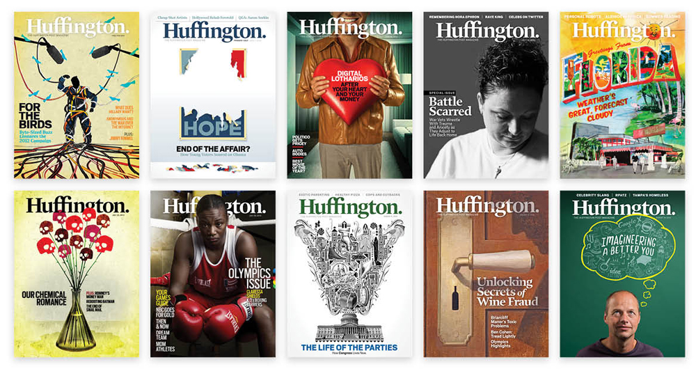
As we publish our 10th issue of Huffington magazine and in anticipation of our September 10th Design and Tech Meet Up in partnership with SPD, here’s a snapshot of lessons learned developing and publishing a new digital-only magazine:
1. Start with the end in mind. The Huffington Post was looking for a vehicle to let readers digest long form journalism. Reading 3,000+ word stories has never been great online, and HuffPost had begun to add this layer of journalism to the bite-size content on the site. A team was formed experienced in the ways of creating dynamic apps, weekly magazines, and engaging journalism. We whiteboarded a few basic ideas and quickly landed on “Huffington” as the title, which we felt was an extension of the HuffPost brand.
2. Choose a publishing platform. We started working with the team that built Editions — a customizable feed based magazine — and Engadget Distro — a bespoke weekly built by designers in InDesign. We decided to use the bespoke model to begin this as it would give us greater control of the design in a form factor that resembled a magazine.
The Huffington Post is in a unique position as both a content company and a technology company. This allowed us to develop our own publishing platform and not rely on an off-the-shelf product. In the tech world, its known as “Minimal Viable Product” — the least that’s needed to get a great product into people’s hands. It’s very different from how we think on the editorial side: It’s gotta be perfect for going to press! As the audience for Huffington magazine grows, we will invest in the expansion of the platform. There’s plenty more to do!
3. Appetizers, Meal, Dessert. Working with our Exec Editor, Tim O’Brien, we landed on a magazine convention of story bits in the front, followed by a series of columns by our HuffPost bloggers. From there we would dive into long form features and wrap up with lighter fare in the back. The idea was that it would be just like a good meal.
4. Don’t forget your DNA. We knew that when we were developing this app, that we had to make sure that commenting and social sharing were included. We decided to replace the standard endslug at the end of stories with a call to action to comment. For HuffPost, stories are the beginning of the conversation.
5. Social from Day 1. A must-have for us was the ability to share articles from the app. We built in the ability to share via Facebook, Twitter and email. It’s a must in the current environment. We can’t live in walled gardens in 2012.
6. Build the dream team. After we got the green light to produce the magazine, we had to make some quick decisions on which features would make it into version 1. While the development team was building, we used this time to build a kickass team of magazine designers, a photo editor and a production guru. We’re designing for the tablet and not replicating print. Pretty quickly Andrea Nasca, Peter Niceberg, Anna Dickson, Eve Binder, Susana Soares, and Troy Dunham we’re on board and we were counting down to the launch.
7. Just because we can, doesn’t mean we should (also known as: EDIT!).With digital, we don’t have to worry about page count against ads. We’ve run into issues at times where we have great content that we want to run and because we don’t have to worry about pages, opt to run it. On the other hand, you have to be careful that you’re not putting too much in an issue for no other reason than you can. We’ve learned to edit, to move pieces, to push things back and when to throw something in. Related content works well and gives us a reason to run something as another feature, but we just don’t throw things in willy nilly. Furthermore, we are very cautious about embedding too much video in the app because it slows the download. Editing is a good thing!
8. Never too dark for the iPad! This is super photo nerdy — but it is something that our photo editor Anna Dickson loves. She says, “During my print days, we always used to run into the issue of ‘too dark for print.’ We’d have to cut gorgeous photos simply because they couldn’t replicate well in print.” Well ... those days are over! The iPad renders photos of all stripes beautifully — especially when we can take advantage of the new Retina display.
9. Plan ahead. This is a thoughtful, measured, custom product and we have more time to design it soberly than we may have on the web. But to do that well requires advance planning, great communication with design, tech and edit, a respect for process, and commitment to a tightly drawn editorial calendar and daily work flow.
10. It’s an app. That’s right. It’s not a magazine. We love the traditional magazine virtues that Huffington embraces and embodies, but it’s a digital product and the design needs to showcase the technological differentiators that make it unique as an app. We have big ambitions for making the design pop technologically, so expect to see more of that once our mobile team comes together.